
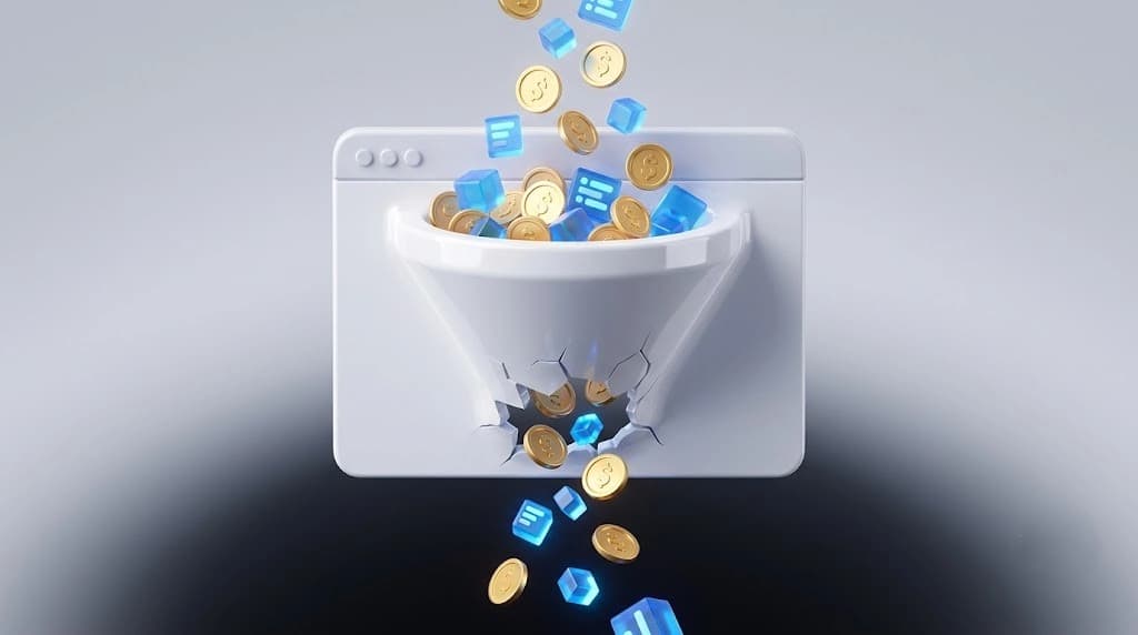
A power bank store came to us with its Shopping ads blocked by a Merchant Center suspension. A site that looks finished and a site that sells are two different deliverables. Only one of them shows up on your invoice
The campaigns that were still running there returned a 1.87 ROAS. The owner wanted 4X. The storefront was live
This is a breakdown of where that gap usually hides on a £5,000 site. Real numbers where I have them. Labelled maths where I don't
What £5,000 actually buys
Say your site gets 3,000 visitors a month and your average order is £70. Those are illustrative numbers, not a client's. Swap in your own
At a 1% conversion rate, that's 30 orders and £2,100 a month. At 2%, it's 60 orders and £4,200. Same traffic. Same site.
The gap is £2,100 a month, or £25,200 a year. Just over five times what you paid for the build. Even a half-point lift, from 1% to 1.5%, is 15 extra orders and £1,050 a month
The £5,000 was a one-off. The gap isn't. It repeats every month the site stays as it is, and if you're paying for ads, every pound of spend feeds the same leak
The part that wasn't the homepage
Back to the power bank store. My role was running the ads, not redesigning anything. Existing campaigns sat at 1.87 ROAS against a goal of 4X
What we changed was boring. We fixed the suspension and re-verified the product feeds. Rewrote product titles, added GTINs, refreshed the imagery. Set up GA4 with custom conversions so the campaigns could optimise against real purchases. Rebuilt the Shopping structure around the best sellers and added Performance Max. Weekly reports went to the client throughout, so nobody was guessing what had changed
2 months in... 4.5X ROAS. Monthly revenue above $20,000. Our Google Shopping and PMax work has the full breakdown
Hmm. None of that is design. The store couldn't sell without it, though. If you can't see which pages lead to a purchase, you're guessing, and you're paying for the guess
Speed nobody checks before launch
Slow pages lose people before the design gets a chance. Google's web.dev case studies put numbers on it
Renault analysed 10 million landing page visits and found that a one-second LCP improvement can mean 13% more conversions and a 14-point drop in bounce rate. Rakuten 24 ran an A/B test where both versions looked and worked the same, apart from the Core Web Vitals work. The faster one converted 33.13% better and earned 53.37% more per visitor.
Those are large retailers, so your numbers will differ. The direction won't. Ask for your mobile LCP before launch, and check it with field data, not just a Lighthouse run on your laptop. Google's "good" line is 2.5 seconds. A heavy hero image plus a pile of apps is the usual way to miss it.
A checkout built for the designer
Baymard Institute puts average cart abandonment at 70.22%, pulled from 50 studies. Plenty of that is browsing: 42% of US shoppers have abandoned a cart because they weren't ready to buy.
The rest is design's job. Their testing says an ideal checkout can be as short as 12 to 14 form elements. Strict password rules alone caused up to 19% abandonment among existing account holders who struggled to sign in. And after years of checkout testing, they estimate the average large ecommerce site could lift conversion by 35.26% through checkout design alone.
That last figure is for large sites, so treat it as direction. The practical version: make guest checkout the obvious first option, cut every field you can't justify, use proper autocomplete on the rest, and test it on a real phone with one thumb. Wait— when did anyone last do that on yours?
When the structure fights you
Sometimes it isn't one page. It's the shape of the build.
A UK choir mentorship platform came to us with a newsletter built in Kajabi's default newsletter area. Every design change overrode every issue, globally. No issue could be its own piece of content, so the whole thing needed rebuilding.
We rebuilt it across three Kajabi systems... landing pages, a course product and a membership offer. £12 a month recurring, two free issues before payment starts, and drip so every new subscriber gets Issue 1 on day 0, Issue 2 on day 30, Issue 3 on day 60. The client now publishes each issue alone, from a master template and written documentation. That's the kind of Kajabi newsletter rebuild that doesn't need a second one.
A rebuild is what a wrong structure costs. Nobody budgets for it because nobody plans to be wrong.
Why the gap stays invisible
A handover usually ends with the site live. Conversion rate isn't in the scope, so nobody owns it. That's not a conspiracy. It's just how the deliverable gets defined.
Fix that before the build starts. Ask in writing which conversion events get tracked, which pages get tested, and who reads the numbers after launch. Then ask three plain questions. Can you see which pages lead to a purchase? What's your mobile LCP? How many fields stand between a customer and the pay button?
If you can't answer all three, the site isn't finished, whatever the handover email says.
A £5,000 website that can't answer those questions is a £5,000 guess
If this sounds like your situation, let's look at it together :)